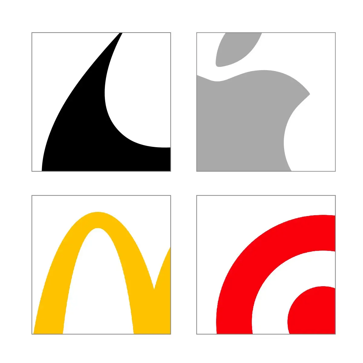
Do Nike, Apple, Target, Starbucks or McDonalds appear in mind? The largest brands in the word tend to have the simplest design scheme, most sticking to only flat, one dimensional shapes and nothing else. The name itself becomes secondary, and in some cases, there is no name needed at all. What all these companies have in common is how identifiable their brands have become.
Check out the photo above, which showcases merely tiny snippets of a variety of brands and industries. How many do you immediately recognize?
The reason you are surprisingly able to recognize these graphic symbols is simple — less is more. Mastercard proves this in their recent decision to remove their company name from their logo — a few massive brands have taken. The graphic designer behind the project, Michael Beirut, mentioned that “We live in a time where, increasingly, we communicate not through words but through icons and symbols”. Realizing that many people identify with symbols more than words, brands are making major moves to focus on symbols. This shift has helped to catapult brands to internationally recognizable status, breaking all language barriers.
What does this mean for most brands?
The most important thing to consider for your brand is immediate and long-lasting recognition, and to leave an unmistakable impact on your viewers. The faster it is to absorb a brand, the better chance it has of being remembered — especially in a world where we are constantly bombarded with visuals from the moment we wake up to our last moments awake each day.
How can I take my brand to that level?
To succeed, a simpler approach to the overall design and execution is all that is needed when taken seriously. Focusing on design that will compliment your brand and work on being easily recognizable is key. The right team building your brand is key to help elevate your status amongst your competitors. Every company and brand should strive to reach the highest level of recognition, and ultimately, “pull a Mastercard”