In the world of branding, few identities are as universally recognized and revered as that of the Olympic Games. The Olympic brand is not just a logo; it’s a symbol of unity, excellence, and global collaboration. Recently, we had the chance to delve into the Olympic Brand Guidelines, and it was a fascinating exploration of how this iconic brand maintains its powerful presence. Here’s a look into the meticulous details and thought processes that go into crafting the visual identity of the Olympics.
The Foundation of the Olympic Brand
The roots of the Olympic brand stretch back nearly 3,000 years, originating from the ancient Olympic Games. These games promoted peace, friendship, and respect through sport—values that remain integral to the Olympics today. The modern Olympic brand builds on this rich heritage, aiming to inspire hope and progress through its visual and thematic elements.

Core Elements of the Brand
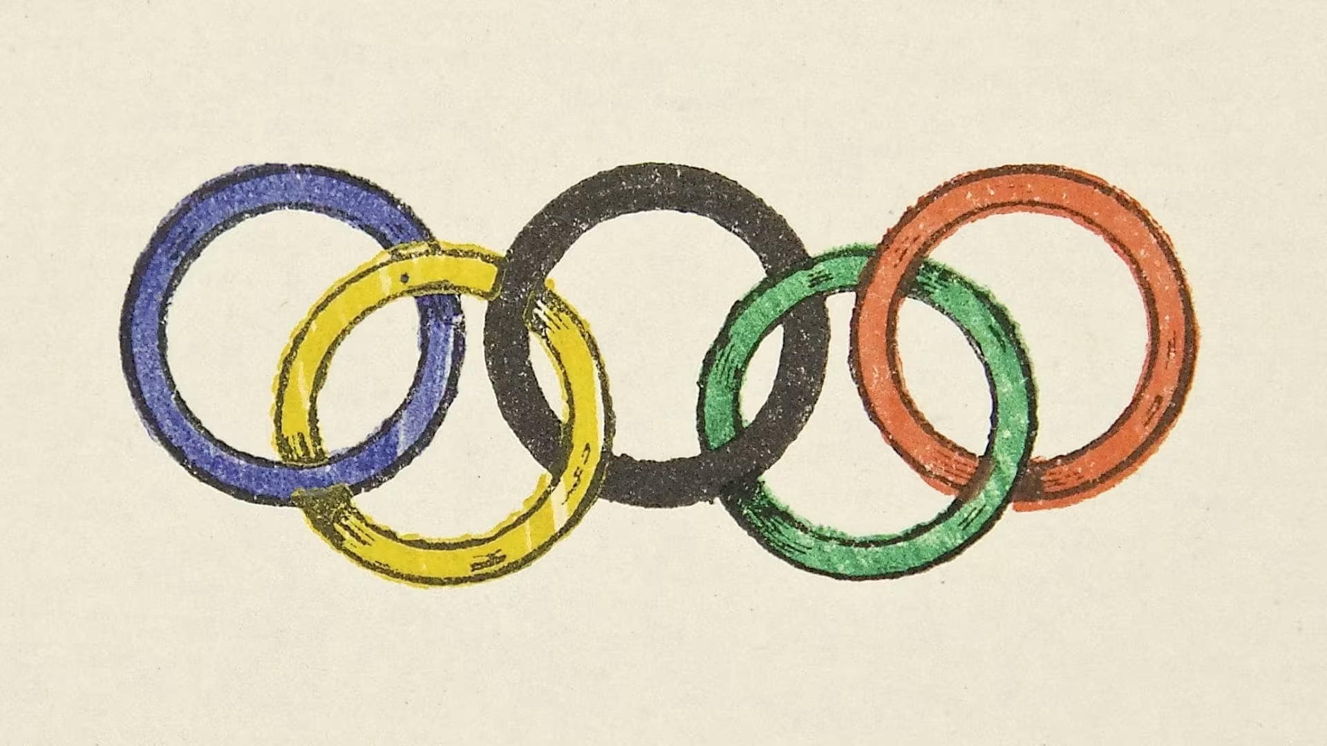
1. The Olympic Symbol: The Olympic rings are perhaps the most recognizable aspect of the brand. These five interlocking rings, representing the continents of Africa, the Americas, Asia, Australia, and Europe, symbolize the unity and diversity of the global community. Designed by Pierre de Coubertin in 1913, the rings debuted at the 1920 Antwerp Games and have since become synonymous with the Olympics.
2. Color Palette: The Olympic brand employs a primary color palette of blue, yellow, black, green, red, and white. These colors were chosen to represent the flags of all nations at the time the rings were created. The guidelines specify how these colors should be used to maintain consistency and ensure accessibility across various applications.
3. Typography: The Olympic type system includes three exclusive typefaces: Olympic Headline, Olympic Sans, and Olympic Serif. Each typeface serves a specific purpose, from bold and punchy titles to traditional and elegant editorial text, ensuring that all communications are clear and visually cohesive.

System Elements and Flexibility
The brand guidelines emphasize a balance between consistency and flexibility. This balance is crucial in allowing the brand to remain recognizable while also being adaptable across different mediums and cultural contexts. Key system elements include:
-
- Grids and Formats: Structured layouts that create a spacious and inviting feel.
- Logo System: Tiered arrangements that ensure the Olympic rings and related designations are consistently presented across various entities and activities.
- Graphic Devices: Elements such as the “Field of Play” and “Sport Lines” that add dynamic visual interest while maintaining the brand’s integrity.
Applications and Guidance
The guidelines provide detailed instructions on applying the brand elements in various contexts, from digital interfaces to physical merchandise. Here are some key points:
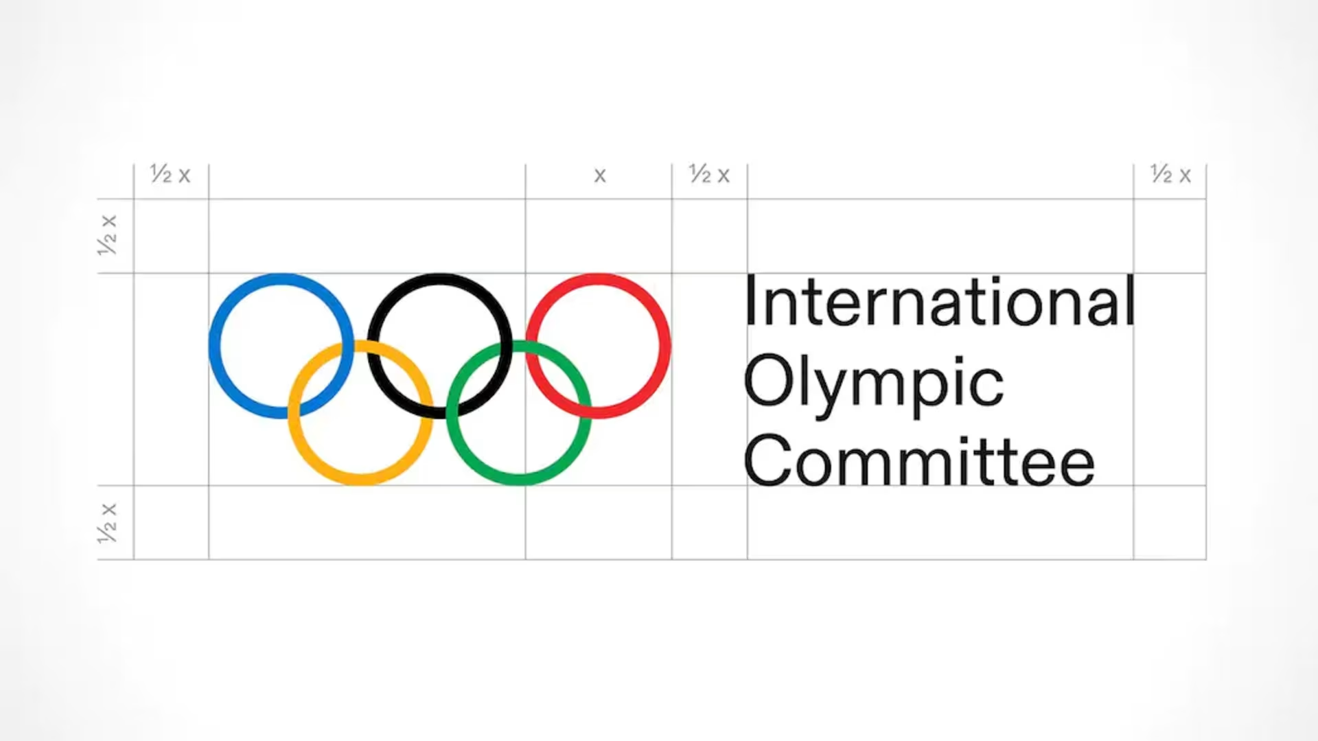
- Use of the Olympic Rings: The rings should never be altered or crowded by other elements. They should always maintain their visual integrity and legibility.
- Color Usage: Olympic colors should be used boldly, with significant areas of white or black to create impact and clarity. Extended colors are reserved for specific digital applications and should complement the primary palette.
- Typography Rules: Proper tracking, kerning, and leading are essential for readability and aesthetic quality. Different typefaces should be combined thoughtfully to enhance communication.
Embracing Diversity and Innovation
The Olympic brand is not static; it evolves with time while staying true to its core values. The guidelines highlight the importance of representing diversity, promoting inclusivity, and inspiring progress. This is evident in their approach to photography, illustrations, and infographics, which are designed to reflect the vibrancy and dynamism of the Olympic spirit.

The Longevity of Branding
The Olympic Brand Guidelines offer a masterclass in maintaining a global brand’s integrity while allowing for creativity and adaptation. They ensure that every expression of the Olympic brand, from a digital banner to a physical venue, resonates with the values of excellence, respect, and friendship. For anyone interested in branding and design, these guidelines are a treasure trove of insights and inspiration.