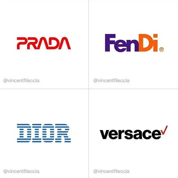
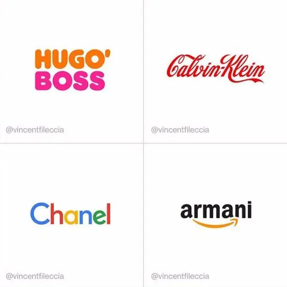
Chanel, Armani, and Hugo Boss are all name brands that come to mind when we think of high-end luxury.
That’s why when artist and designer Vincent Fileccia created logo parodies by combining the names of such major high-end fashion brands with more well-known mainstream companies, the results were hysterical.
The visual difference.
Color- When comparing high-end to mainstream brands, the first thing we notice is the use of fewer colors. Most upscale companies use minimalism to their advantage, limiting the color palette to just one color or only using black and white.
Form- The use of angular shapes and letterforms are usually implemented in most high-end logos. Unlike other brands that use more organic letterforms, fashion brands approach their visual identity with sharper angles, displaying a more minimalistic look.
Aesthetic- The overall feeling when we look at a high-end fashion brand is usually the same: elegance and luxury. Less is more seems to be the motto for most of these companies, cutting back on extra embellishments. Sleek and sharp is usually the targeted aesthetic.
The importance of logos.
After viewing the logo parody by Vincent Fileccia, it’s clear to see the importance a logo has on a brand’s overall aesthetic and targeted demographic. In the case of high-end fashion brands, their logo/mark needs to sell luxury and wealth, which can not be done with a logo that doesn’t match their look. If the logo is too colorful, whimsical, and bubbly, it may detract from their targeted demographic which will effect business.
It’s evident by Fileccia’s logo parody that brands can be perceived differently depending on their visual identity, which makes the building of such brands crucial to the companies success. A company like Hugo Boss is definitely not trying to sell donuts, so its logo shouldn’t have elements that portray that. No matter the company, every brand needs to take into account what their visual identity says about them and if their identity conveys the symbolic meaning of their brand.

